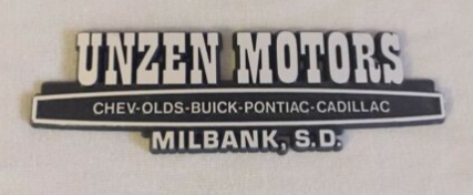
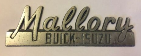
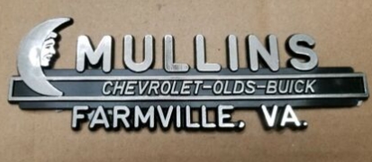
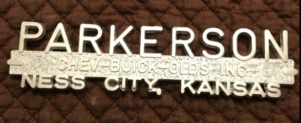
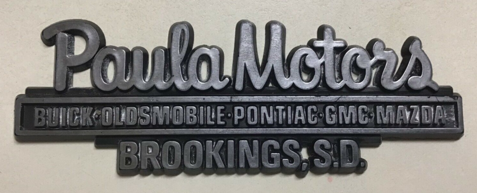
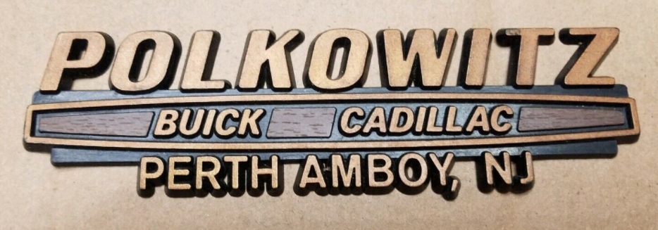
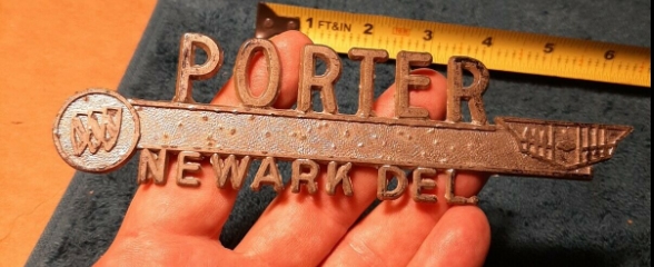
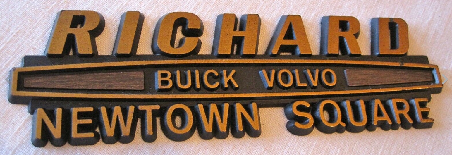
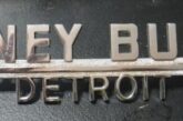
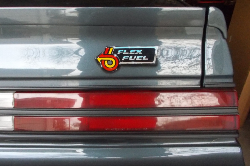
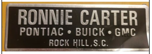
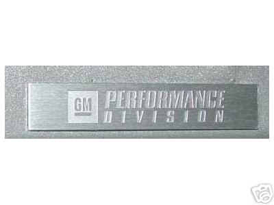
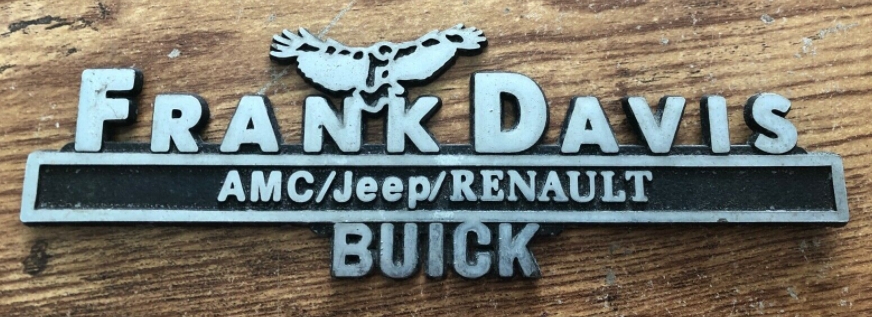
As time progressed, the rectangular buick dealer emblems evolved into being a little more stylish. The words moved from inside the squares to the outer edges on the top and bottom sides, with the center either being empty, containing some of the Buick logos, or the GM divisions that they represented.
Usually black in color for the backgrounds, they had a silver-tone raised highlight for the letters which was either chrome plated or a polished surface.
.
.
.
.


